. "A Simple Explanation of HTML5 in Layman’s Terms." Mediascope, Inc.. N.p., 06 2011. Web. 5 Nov 2012. <http://mediascopeinc.wordpress.com/2011/07/16/a-simple-explanation-of-html5-in-layman’s-terms/>.
. "Definition of: rich media ." PCMag.com. N.p.. Web. 4 Nov 2012. <http://www.pcmag.com/encyclopedia_term/0,1237,t=rich media&i=50527,00.asp>.
. "Flash Vs HTML5." code computerlove. N.p.. Web. 16 Oct 2012. <http://labs.codecomputerlove.com/FlashVsHtml5/>.
Allaire, Jeremy. "The Future of Web Content – HTML5, Flash & Mobile Apps." Hot Topics. N.p., 05 2010. Web. 22 Oct 2012. <http://techcrunch.com/2010/02/05/the-future-of-web-content-html5-flash-mobile-apps/>.
Boudreaux, Ryan. "HTML5 vs. Flash: The state of the debate." TechRepublic. N.p., 08 2012. Web. 30 Nov 2012. <http://www.techrepublic.com/blog/webmaster/html5-vs-flash-the-state-of-the-debate/1556>.
Bright, Peter. "Adobe's continuing revolution pushes the cutting Edge of HTML5 development." ars technica. N.p., 24 2012. Web. 16 Oct 2012. <http://arstechnica.com/information-technology/2012/09/adobes-continuing-revolution-pushes-the-cutting-edge-of-html5-development/>.
Cavazza, Fred. "Why Opposing HTML5 And Flash Is Nonsense." Forbes. Forbes, 17 Jul 2011. Web. 30 Sep 2012. <http://www.forbes.com/sites/fredcavazza/2011/07/17/why-opposing-html5-and-flash-is-a-non-sense/>.
Charlet, Jeremie. "Can New Web Technologies HTML5 and CSS3 Kill Flash?." slideshare.net. N.p., n.d. Web. 4 Nov 2012. <http://www.slideshare.net/charlet_jeremie/can-html5-css3-kill-flash>.
Chone, Jeremy. "What are the advantages of Flash over HTML5?." Quora. N.p., 27 2011. Web. 30 Nov 2012. <http://www.quora.com/What-are-the-advantages-of-Flash-over-HTML5>.
"Data Visualization For Open-Minds." FiberGeneration. N.p., 29 Aug 2007. Web. 20 Sep 2012. <http://fibergeneration.typepad.com/welcome/2007/08/data-visualizat.html>.
Friedman, Vitaly. "Data Visualization: Modern Approaches." Smashing Magazine. N.p., 02 Aug 2007. Web. 20 Sep 2012. <http://www.smashingmagazine.com/2007/08/02/data-visualization-modern-approaches/>.
Friendly, Michael. "Bright ideas." Gallery of Data Visualization. N.p., 20 Aug 2012. Web. 20 Sep 2012. <http://datavis.ca/gallery/bright-ideas.php>.
Gube, Jacob. "10 Useful Flash Components for Graphing Data." Six Revisions. N.p., 05 2009. Web. 29 Oct 2012. <http://sixrevisions.com/flashactionscript/10-useful-flash-components-for-graphing-data/>.
Hardy, Ian. "Coding the future: HTML5 takes the internet by storm." BBC News. N.p., 7 2012. Web. 4 Nov 2012. <http://www.bbc.co.uk/news/business-17931814>.
Hickson, Ian. "HTML5 A technical specification for Web developers." WHATWG. N.p.. Web. 11 Nov 2012. <http://developers.whatwg.org/introduction.html>.
Jackson, Joab. "Adobe Flash vs. HTML5." PCWorld. N.p., 03 2011. Web. 16 Oct 2012. <http://www.pcworld.com/article/243130/adobe_flash_vs_html5.html>.
Joy, Vail. "7 Facts and Myths of HTML5." JUST CREATIVE. N.p., 27 2012. Web. 11 Nov 2012. <http://justcreative.com/2012/03/27/html5-facts-and-myths-tips/>.
Machlis, Sharon. "22 free tools for data visualization and analysis." COMPUTERWORLD. N.p., 20 Apr 2011. Web. 23 Sep 2012. <http://www.computerworld.com/s/article/9215504/22_free_tools_for_data_visualization_and_analysis>.
Marsal, Katie. "Flash, HTML5 comparison finds neither has performance advantage." Apple Insider. N.p., 10 2010. Web. 30 Nov 2012. <http://appleinsider.com/articles/10/03/10/flash_html_5_comparison_finds_neither_has_performance_advantage.html>.
Matthews, Whitney. "How to use fun (and free) data visualization tools for online storytelling." Poynter.. N.p., 24 Feb 2011. Web. 20 Sep 2012. <http://www.poynter.org/how-tos/digital-strategies/115906/how-to-use-fun-and-free-data-visualization-tools-for-online-storytelling/>.
McCandless, David. "ANNOUNCING OUR VISUALIZATION AWARDS SHORTLIST…."Information is Beautiful. N.p., 21 Aug 2012. Web. 20 Sep 2012. <http://www.informationisbeautiful.net/2012/announcing-the-information-is-beautiful-awards-shortlist/>.
Perdue, Tim. "HTML5 vs. Flash: The Battle for Rich Media." About.com. N.p.. Web. 2 Nov 2012. <http://newtech.about.com/od/softwaredevelopment/a/Html5-Vs-Flash-The-Battle-For-Rich-Media.htm>.
Perez, Sarah. "Does HTML5 Really Beat Flash? The Surprising Results of New Tests." ReadWriteWeb. N.p., 09 Mar 2010. Web. 30 Sep 2012. <http://www.readwriteweb.com/archives/does_html5_really_beat_flash_surprising_results_of_new_tests.php>.
Probst, Tim. "Interesting New Ways to Present Data."Probstisms. N.p., 29 Aug 2007. Web. 29 Sep 2012. <http://blog.timprobst.com/2007/08/29/interesting-new-ways-to-present-data/>.
Shankland, Stephen. "HTML vs. Flash: Can a turf war be avoided?." CNET. N.p., 03 2010. Web. 22 Oct 2012. <http://news.cnet.com/8301-30685_3-20000037-264.html>.
Steier, David. "Visualization Tech Trends 2011." Deloitte . Deloitte Consulting LLP, 2011. Web. 23 Sep 2012. <http://www.deloitte.com/view/en_US/us/Services/consulting/all-offerings/hot-topics/technology-2011/4887c2659060e210VgnVCM2000001b56f00aRCRD.htm>
Team, Wix. "New Infographic: HTML5 Vs. Flash."wix.com blog. N.p., 05 2012. Web. 16 Oct 2012. <http://www.wix.com/blog/2012/07/new-infographic-html5-vs-flash/>.
Team, The Wix. "The History of HTML5." wix.com blog. N.p., 11 2012. Web. 3 Dec 2012. <http://www.wix.com/blog/2012/07/the-authentic-infographic-history-of-html5/>.
Vaughan-Nichols, Steven. "Flash is dead. Long live HTML5.." ZDNet. N.p., 09 Nov 2011. Web. 1 Oct 2012. <http://www.zdnet.com/blog/networking/flash-is-dead-long-live-html5/1633>.
Yau, Nathan. "Flash vs. HTML5." FlowingData. N.p., 10 May 2011. Web. 30 Sep 2012. <http://flowingdata.com/2011/05/10/flash-vs-html5/>.
Yee, Doris. "How Not to Suck at Designing Infographics."GOOD. N.p., 23 2012. Web. 15 Oct 2012. <http://www.good.is/posts/how-not-to-suck-at-designing-infographics>.
Tuesday, September 18, 2012
Monday, September 17, 2012
Post for Marlowe
Blog Link:
http://marlowecrews.blogspot.com/2012/09/abstract-finally-finding-its-way-to.html

Thought this article might be of interest to you:

http://marlowecrews.blogspot.com/2012/09/abstract-finally-finding-its-way-to.html
Just a thought of another form in which to express your stories/poems through visuals, it's a site where you load your words and choose/upload a visual to express them in. It could be a really interesting way to express multiple types of media in one piece. You could also do one of these creations and use it to then create a painting instead of just printing it out..
Example:

--------------------------------------------------------------------------
"Veilige Veste is a Former Office Building Transformed into
a Women's Shelter in The Netherlands"

Tuesday, September 11, 2012
Ideas
To show multiple forms of visuals using 1 set of data.
1 - Charts
2 - Spiderwebs
3 - Interactive Links
4 - Geographical Maps
1 - Charts
2 - Spiderwebs
3 - Interactive Links
4 - Geographical Maps
Saturday, September 8, 2012
Abstract
Data visualization is the newest
form of global communication through a series of organized visuals that form
connections between information and users. With the advent of the Internet and
the wealth of information that is has brought to us, we as users are bombarded
with great amounts of information on a daily basis. Attempting to sift through
all of this information can be quite taxing, so the combination of information
with visual design has helped create a place where we can view the information
in one visual arena.
My goal is not to write a research
paper on what data visualization is, but to create a series of visual designs
that embodies what it looks like and how it can offer an organized and
compacted form of what it essentially is. I will probably create several
animated flash files and create a mini film about what data visualization is.
Tuesday, September 4, 2012
Cindy's Fiber Shed
Blog Link:
http://thoughts-to-threads.blogspot.com/
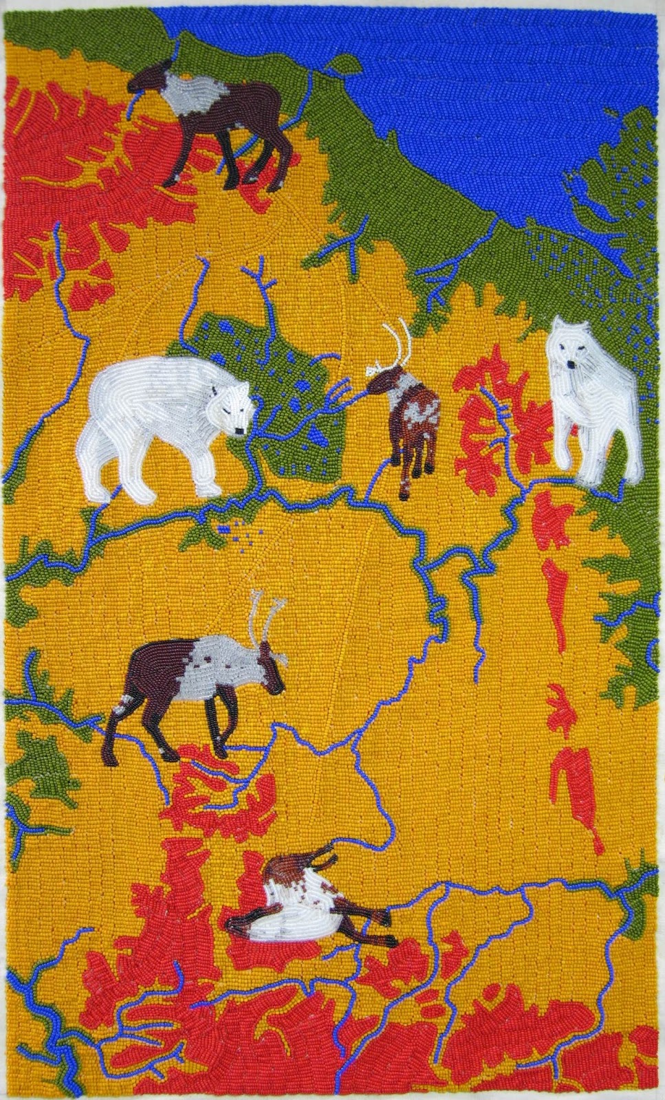
A thought about how to show your map. If you are able to get each place to send you swatches of fabrics that they create and cut them out into shapes of the animals, mountains, farm buildings, etc to represent each company. Then sew them onto a large piece of muslin or some other fabric to make your map.


-------------------------------------------------------
Thought this was something interesting you might want to check out:
http://www.stumbleupon.com/su/2PySDE/inhabitat.com/wind-powered-knitting-machine-lets-nature-knit-scarves/
http://thoughts-to-threads.blogspot.com/
A thought about how to show your map. If you are able to get each place to send you swatches of fabrics that they create and cut them out into shapes of the animals, mountains, farm buildings, etc to represent each company. Then sew them onto a large piece of muslin or some other fabric to make your map.
Examples:


-------------------------------------------------------
Thought this was something interesting you might want to check out:
http://www.stumbleupon.com/su/2PySDE/inhabitat.com/wind-powered-knitting-machine-lets-nature-knit-scarves/
Saturday, September 1, 2012
Data Visualization Topic Ideas
1. Making / Displaying Connections
- Creating Global Webs
2. Visual Communication
- Content + Graphics = Visual Data
Newsmap's objective is to simply demonstrate visually the relationships between data and the unseen patterns in news media.
Currently, the internet presents a highly disorganized collage of information. Many of us are working in an information-soaked world. There is too much of everything. We are subject everywhere to a sensory overload of images, bombarded with information; in magazines and advertisements, on TV, radio, in the cityscape. The internet is a wonderful communication tool, but day after day we find ourselves constantly dealing with information overload. Today, the internet presents a new challenge, the wide and unregulated distribution of information requires new visual paradigms to organize, simplify and analyze large amounts of data. New user interface challenges are arising to deal with all that overwhelming quantity of information.
3. Paradigm Changing: Conveyance of Messages to Readers
- Leaving search method of perusing text to perusing gathered visuals
4. New Marketing Tool
- Heat Signatures of User Viewing Patterns
- "We Feel Fine" Site:
We Feel Fine has been harvesting human feelings from a large number of weblogs. Because blogs are structured in largely standard ways, the age, gender, and geographical location of the author can often be extracted and saved along with the sentence, as can the local weather conditions at the time the sentence was written. All of this information is saved.
The result is a database of several million human feelings, increasing by 15,000 - 20,000 new feelings per day. Using a series of playful interfaces, the feelings can be searched and sorted across a number of demographic slices, offering responses to specific questions like: do Europeans feel sad more often than Americans? Do women feel fat more often than men? Does rainy weather affect how we feel? What are the most representative feelings of female New Yorkers in their 20s? What do people feel right now in Baghdad? What were people feeling on Valentine's Day? Which are the happiest cities in the world? The saddest? And so on.
At its core, We Feel Fine is an artwork authored by everyone. It will grow and change as we grow and change, reflecting what's on our blogs, what's in our hearts, what's in our minds. We hope it makes the world seem a little smaller, and we hope it helps people see beauty in the everyday ups and downs of life.
------------------------------------------------------------
A Heatmap is an easy way to understand what users do on your site. It’s a visual representation showing you where users click and what they do.
5. New Way of Presenting Statistical Data
- Taking large amounts of information and compressing it into
smaller more visual arena
- Company promises that the days of mining through pages and
pages of tiny thumbnails in an effort to find the item you are
looking for are over.
Data Visualization Info Sites

--------------------------------------------------------------------

--------------------------------------------------------------------
--------------------------------------------------------------------

--------------------------------------------------------------------

--------------------------------------------------------------------
TED Talks
Subscribe to:
Posts (Atom)